
When I started on the consumer telehealth app at Amwell, I pictured my user the way most designers do: calm, rational, reading every label I wrote. The person who actually showed up had a fever of 102 and a crying toddler on her hip. That gap — between the user we design for and the human who actually arrives — became the most useful lesson of my eight years there.
In my head, she was calm, rational, sitting at a desk with good lighting, reading every label I wrote, appreciating every carefully aligned pixel.The reality? She had a fever of 102, one hand holding a phone and the other holding a crying toddler, and she just wanted to see a doctor before the Tylenol wore off.
Lesson 1 – Never let anyone start at zero.
There is an old study about car wash loyalty cards. One group got a card with 8 empty stamps. Another got a card with 10 stamps, 2 already filled. Same 8 washes required — but the group with the head start finished at nearly double the rate. The closer people feel to the finish line, the harder they push toward it.
Now look at almost any onboarding: “0% complete.” Zero. You are telling a patient who just spent effort creating an account that they have done nothing. 0% feels like standing still. 20% feels like momentum. The work is identical — only the starting line moved. So count something they already did. Creating the account is step one. Why are we so stingy about giving people credit?
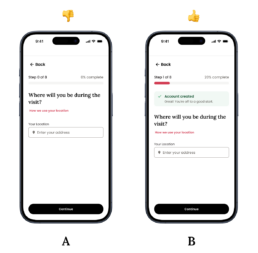
Option A: The patient just created an account, but the onboarding still starts at 0%. Even though they already put in effort, the system gives them no sense of progress or momentum.
Option B: The system gives the patient credit for creating an account, so onboarding begins at 20% complete. The work is the same, but the head start creates momentum and makes progress feel real.
Lesson 2 – Answer for them first.
Every empty field on an intake form is a question, and every question is a small tax on a sick person’s mind. Psychologists call it decision fatigue — I call it asking a person with a migraine to do paperwork 😁. There is a famous grocery store study where 24 flavors of jam attracted plenty of lookers but almost no buyers; cut it down to 6 flavors and purchases jumped 10x. More choices don’t mean better. They mean harder.
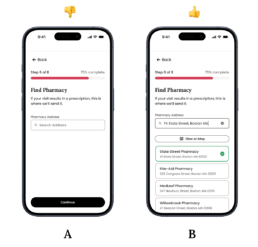
Option A: The address field is empty, so the patient has to manually enter their pharmacy address, even though we already have their location information.
Option B: The system uses the patient’s location to suggest nearby pharmacies, with the closest option clearly recommended. The patient can review, select, or change the pharmacy before continuing. While the patient may still need to change it based on their needs, the default suggestion makes the system feel smarter and more helpful.
If we already know the answer, don’t ask the question. Pre-fill what the system knows. Pre-select what most patients pick. Let the sick person scan and adjust, instead of filling out from scratch. Most users never change a good default anyway — not because they are lazy, but because a default reads like a recommendation from someone who knows better. Be that someone.
Lesson 3 – Give before you ask.
Most apps ask before they give. Sign up to continue. Enter your email to unlock. In healthcare this is even worse, because trust is not a nice-to-have — a person is about to tell your product things they might not tell their own family.
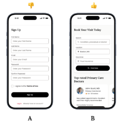
Let the product do something genuinely useful before it asks for anything. Show what’s available, what it costs, who the doctors are — first. This is reciprocity, the oldest trick of human kindness: when someone gives you something first, you feel a pull to return the favor. It is why free samples work absurdly well, and why the best sign-up walls never feel like walls. The user already received something worth coming back for.
Lesson 4 – Let them build something small.
Have you ever assembled IKEA furniture and then quietly admired it, even though it leans slightly to the left? Researchers call this the IKEA effect — we value what we build, far beyond its objective worth. There is an even lazier cousin, the ownership effect: you don’t even need to build it, just feeling it is yours is enough.
A standard sign-up page offers the user nothing to own, so closing the tab costs nothing.
But let a person choose something — their preferences, their care needs, their profile — before the account exists, and everything changes.
A standard sign-up page offers the user nothing to own, so closing the tab costs nothing. But let a person choose something — their preferences, their care needs, their profile — before the account exists, and everything changes. Leaving no longer feels like skipping a form. It feels like abandoning something they made. Remember: you are not collecting information, you are letting a person build their corner of your product.
Lesson 5 – The first number is the ruler
The same price can feel expensive or feel like nothing — it depends entirely on what number the eye saw first. $79 alone on a screen invites mental math and doubt. $79 sitting next to what an urgent care visit costs suddenly looks like the reasonable choice. Restaurants have known this forever: the outrageous steak on the menu exists mostly to make the salmon look sensible.
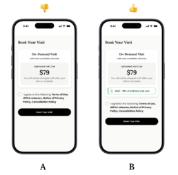
Option A: The price appears alone, so the patient has to decide if $79 is expensive without any reference point. That invites doubt and mental math.
Option B: The system shows $79 alongside a familiar higher cost, such as urgent care. The first number becomes the ruler, making telehealth price feel more reasonable.
Your brain does not evaluate anything in isolation. It measures everything against the thing it saw a moment before. So never show a cost on an empty page. Whatever number appears first becomes the ruler — make sure you chose it, honestly.

Related Posts



Designing Product Icons: Best Practices for a Lasting Impression
As I recall back to the first few years…