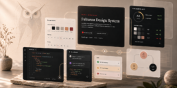
In the digital age, where attention spans are fleeting and visual communication is paramount, the importance of a well-designed product icon cannot be overstated. Icons serve as visual shorthand, instantly conveying information and representing your brand in a compact form. Whether it’s an app, software, or a tangible product, the icon is often the first point of contact users have with your offering. To ensure a lasting impression, here are some best practices to consider when designing a product icon.
1. Simplicity is Key:
The essence of a good icon lies in its simplicity. A cluttered or overly complex icon can confuse users and diminish its effectiveness. Strive for clarity by using clean lines and minimal details. A simple icon is easier to recognize and scales well across different devices and screen sizes.
2. Consistency with Branding:
Your product icon is an extension of your brand identity. Ensure it aligns with your brand’s color palette, typography, and overall design language. Consistency across all brand elements helps reinforce brand recognition and trust.
3. Scalability:
A good icon should be recognizable, whether scaled down to fit on a small mobile screen or enlarged for desktop use. Test your icon at various sizes to maintain its clarity and readability. Icons that are too detailed may lose their impact when scaled down.
4. Distinctive Shape:
A distinctive shape helps your icon stand out amidst a sea of apps or products. Consider a unique silhouette or an easily recognizable outline that separates your icon. Avoid generic shapes that might blend in with competitors. Avoid using stock icons that might lose your unique identity.
5. Meaningful Metaphors:
Icons often represent actions or concepts. Opt for universally understood metaphors commonly associated with the intended function. For example, a magnifying glass for search or a gear for settings. However, be cautious not to rely on clichés unless they genuinely align with your product’s identity.
6. Adaptability to Dark and Light Modes:
With the increasing prevalence of dark mode in user interfaces, design your icon to work seamlessly in both light and dark themes. Ensure that your icon remains clear and visually appealing in various color schemes.
7. Avoid Text:
Icons should communicate their purpose without relying on text. A language-agnostic icon ensures that your product can cater to a global audience. If necessary, integrate subtle symbols or images to convey meaning without words.
8. Test for Recognition:
Before finalizing your icon, conduct usability testing to ensure that users can quickly recognize its purpose. This step is crucial to guarantee that your icon effectively communicates its intended message to your target audience.
9. Adherence to Platform Guidelines:
If your product is part of a specific platform (e.g., iOS, Android), adhere to the platform’s design guidelines. This ensures consistency with the overall user experience and prevents your icon from looking out of place.
10. Regular Updates:
As your product evolves, so should your icon. Consider updating your icon periodically to reflect changes in functionality or design trends. This keeps your brand fresh and relevant.
In conclusion, a well-designed product icon is a visual ambassador for your brand or product. By adhering to these best practices, you can create an icon that captures the essence of your offering and leaves a lasting and positive impression on users. Remember, a picture is worth a thousand words, and a carefully crafted icon can speak volumes about the quality and innovation of your product.
Related Posts