logo
logo
  • HOME
  • WORKS
  • STORIES
  • ABOUT

© 2026 The Red Owl. All rights reserved

Amwell – Experience + Visual Design Logo

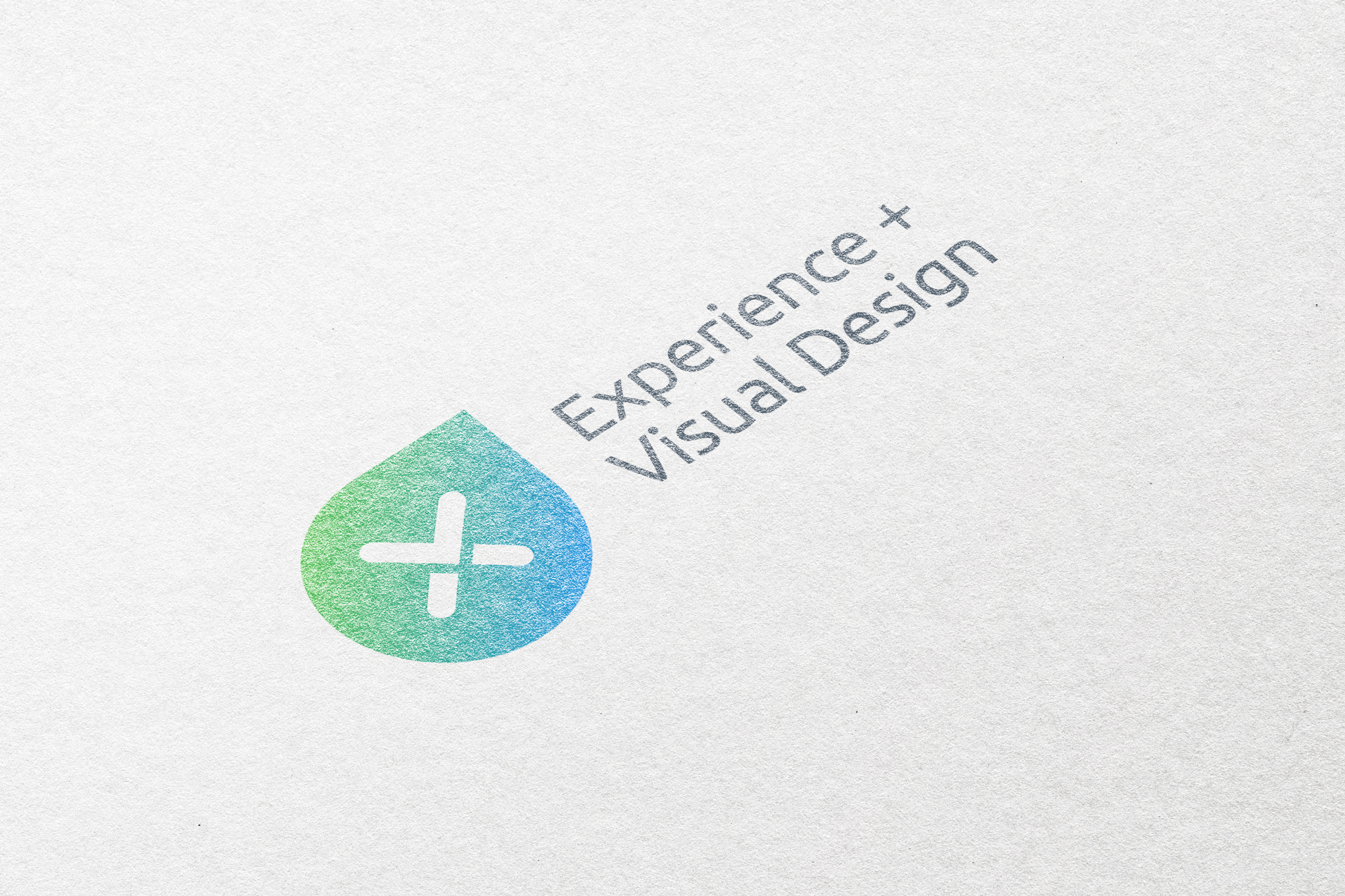
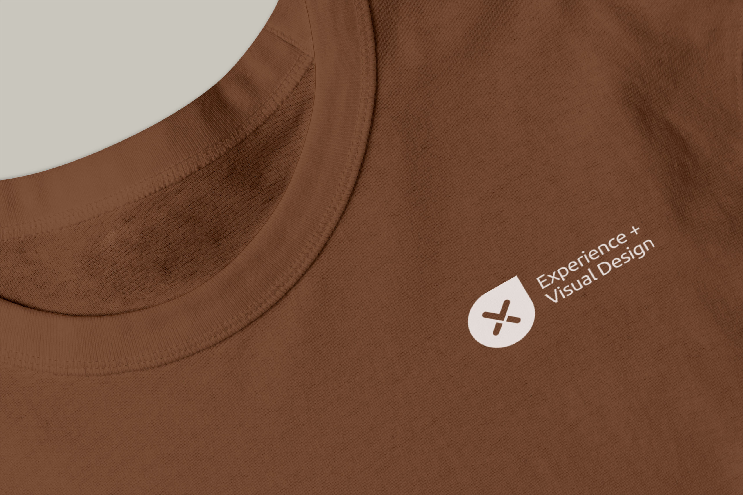
I was honored to be asked to design a logo for the Design Department at Amwell, specifically for the Experience and Visual Design Department, known as XVD.

The logo incorporates the shapes of the letters ‘x’ (for experience), ‘v’ (for visual), and ‘d’ (for design). Interestingly, the ‘d’ is also shaped like a drop of water, symbolizing the dynamic nature of creativity.

This logo serves as the identity for the XVD Department and is used on the team’s T-shirts and merchandise.


ClientAmwellIndustryDesignMy roleCreative + Graphic DesignYear2018

Share
Related Works

Orchid Beauty – Brand Identity

Amwell – Print-ads

Monument Strategies – Identity Set & Website

Protected: Improving the Converge Intake Experience

Protected: Amwell – Provider Dashboard

Protected: Amwell – Virtual Primary Care

Protected: Amwell – Careport Design Concept

Protected: Amwell – Redesign the Provider HUB

EMC – VDI Storage Questionnaire